
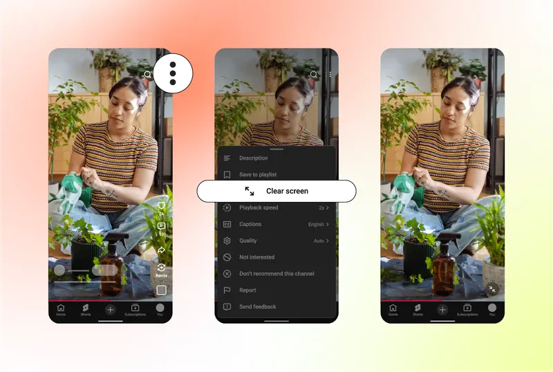
The viewing frame no longer has one state
YouTube's June Shorts update adds Clear Screen to hide interface overlays, double-tap-and-hold for 2x playback and mute. The platform also replaces the thumbs-up icon with a heart and routes negative preference through Not interested and Don't recommend this channel.
These changes can roll out across users and devices at different times. YouTube publishes no causal effect on completion, recommendation, engagement or revenue. What producers can confirm is a larger state space: one master is interpreted under default overlays, Clear Screen, mute, 2x and different feedback paths.
Clear Screen is not permission to push captions to the edge
Viewers must activate Clear Screen, so creators cannot assume everyone uses it. Faces, critical props, phone screens, story text and captions still need to avoid buttons, titles and description areas in the default interface. Clear Screen may reveal a cleaner composition but should not reveal the only instance of essential story information.
2x playback tests structural density. Long captions, several ideas in one frame, one-time text and emotional turns dependent on silence can disappear at speed. Teams need not design every beat for accelerated viewing, but they should know which passages become incomprehensible and decide whether that is an intentional threshold or a fixable expression problem.
Interface updates break simple before-and-after comparisons
When like symbols and negative-feedback routes change, the action cost of preference or rejection changes with them. Comparing aggregate likes, completion or exits before and after the redesign can mislabel a product-interface effect as a story-quality effect. Product version, territory, device and feature availability belong in the release record.
The review can be simple: choose three fixed episodes, inspect default, Clear Screen, mute and 2x on common phones, and record caption occlusion, lost information and exit points. Analytics should mark rollout dates and inspect likes, Not interested, channel suppression, viewing and completion by territory and device. Only a baseline lets a team decide whether the next change came from content or interface.